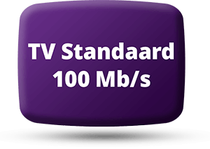
GOTHICISM AND
EXPRESSIONISM

One of the most characteristic elements of Tim Burton films is their visual style. The strange worlds in his movies are designed with a recognizable style that is heavily indebted to German Expressionist films of the twenties. Distorted perspectives, sharp contrasts between light and dark and stylized lighting, typical ingredients not only of German Expressionist cinema but also of Universal's 1930s horror films, are all used to some degree in each of his films. Burton's love for all things dark, shadowy and bizarre has contributed to this visual style in determining the look of his films.

Burton's very first production Vincent is the clearest and most extreme example of this style. Shot in black-and-white using stop-motion animation, it charts the imagination of a kid obsessed by horror movies. Perspective is skewered, angles are jagged and many shots are direct hommages to Das Kabinet des Dr. Caligari. Burton's other films are a combination of this gothic expressionism on the one hand, and cartoonish, bright colors on the other. Pee-Wee's Big Adventure is mostly made up of these primary colors, sometimes resembling a toy shop that has exploded onto the screen. But there is also a dark side to Pee-Wee: his nightmares about various creatures attacking his beloved bicycle are pitch black and very scary, as is the sequence with Large Marge, the ghostly truck driver.

The contrast between these two forms of design is typically employed to illustrate the difference between the films' split worlds. The clearest example is Edward Scissorhands, with the exaggerated pastel colors of the suburb played off against the dark, gothic castle where Edward lives. Whereas "Pastel Suburbia" is troubled by cloud nor rain, Edward's hilltop castle is never reached by sunlight. This visual contrast underlines the difference in character between sweet, trusting Edward and his gentle inventor and the backstabbing, hypocritical neighbors. There is a similar visual contrast between Halloweenland and Christmasland in The Nightmare Before Christmas: while Halloweenland is twisted, dark and gloomy, Christmasland seems to be composed of most of the American syrupy kitsch concerning Christmas.

One of the remarkable things about Tim Burton's films is that it is not the bright, colorful world that is the main frame of reference for the film's diegetic world. It is the dark, twisted world, traditionally associated with evil, that is used to expose the superficial imagery of the representation of the world as a sunny, happy place. Especially in Batman Returns, probably Burton's darkest feature so far, the sun is strikingly absent throughout, and the only scene that is brightly lit is the one where The Penguin is introduced to his candidature for mayor. Batman is more of a confused mixture of the average action film imagery and Anton Furst designed gothicism (which differs significantly from that of Bo Welch), but along with Edward Scissorhands and Batman Returns this has been the film that defined Burton's trademark gothicism. These three films established a recognizable visual system of signification, which was then used in Tim Burton's The Nightmare Before Christmas. The similarity between the design of Halloweentown and that of Vincent is quite remarkable, which isn't that surprising as Riock Heinrichs was visual consultant on both productions..